Canva: How Useful Is it for Professional Print & Design?
September 16, 2024
Bridging Print & Digital with QR Codes
June 30, 2025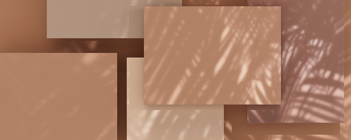
Printed pieces that connect with people include relevant, properly targeted content. Those messages are also delivered on proper paper in a format the audience either expects or will be drawn to through original production and thinking.
Beyond those leading traits, printed communications that attract attention include clear and striking color. That color is much like punctuation in writing: If it’s correct, we might not notice it because it blends in so well. If it’s inconsistent or incorrect, it can instantly detract from what is being presented, reducing its credibility.
The Pantone Matching System (PMS) is crucial to professional printing because it ensures color consistency and accuracy regardless of who is printing what where.
Pantone colors are such standard-bearers in printing that the Pantone Color Institute began awarding the Pantone Color of the Year in 2000. The annual honor recognizes a Pantone color chosen for its reflection of global trends in communication, art, culture and mood. Its high profile influences product development and creative direction across diverse professions.
Pantone Color of the Year 2025
In March 2024, Pantone unveiled PANTONE 17-1230 Mocha Mousse as its Color of the Year for 2025.
The recognition was a joint announcement between Pantone and Wix Studio, the advanced web design and development platform geared toward the design and tech communities, including agencies, freelancers and website builders.
Usually made each December, the announcement was an atypical surprise reveal timed to align with the spring equinox, which symbolizes the tranquility and new beginnings expressed within the earthy, sensorial tone of Mocha Mousse.
Inspired by the simple pleasures of cacao, chocolate and coffee, the rich, chocolatey Mocha Mousse brown embodies warmth, comfort and a touch of thoughtful indulgence. Through its discretely hued spirit, it elevates basic, humble brown to a color of tasteful sophistication.
When blended with the right print format, messages and imagery, Mocha Mousse speaks to our inner desire for simple pleasures, peaceful thought and a regenerative connection to nature. We might not instantly recognize these latent qualities when using Mocha Mousse for printing, but therein also lies their power: They reach us at a more instinctive level.
Mocha Mousse’s versatility allows it to stand alone or serve as a strong foundation for other visual elements, enhancing an array of palettes and applications for customized printed pieces.
Why Are Pantone Colors Special?
A professionally printed communication piece will exhibit the following qualities:
colors that match the intended design without color shifts, fading, oversaturation or variation among copies
crisp and readable text supported by high-resolution images
correct registration, meaning all colors are perfectly aligned, layers are not misaligned and edges on text and shapes look clean
paper stock and quality that are proper for the project (e.g. glossy for photos, matte for elegant designs)
finishing that includes straight trimming; no unintended white borders or off-center designs; and folds, creases or die-cuts that are even and clean
At Aurora Fastprint, Pantone colors such as Mocha Mousse factor into our approach to print production that elevates marketing strategy for our customers from Aurora, Oswego, Montgomery, Sugar Grove, Naperville and Yorkville. We integrate PMS into our systems for its:
professionalism. Color integrity is sacred in printed marketing, and Pantone is the gold standard for color accuracy. When clients see we offer Pantone matching, they know they’re working with professionals who care about their brand. PMS supports the fine details that earn trust, loyalty and repeat business from an audience.
visual impact. Color is a powerful marketing tool. The right colors will trigger the right emotions and continue the message where the words leave off. With PMS, the Aurora Fastprint team can guide customers through the color choices that will best represent them through printed pieces with a consistent look and feel.
The Power of Pantone: What Lies Beneath
Pantone colors such as Mocha Mousse achieve their impact through a standardized system of highly diverse color identification and reproduction.
Total Color Consistency
Pantone provides a universal color language, so when a designer or print-production specialist refers to “PANTONE 17-1230 Mocha Mousse,” everyone knows exactly what that color should look like. With a library of around 1,800 colors, PMS is so precise that the same color can be printed across different papers and materials with zero variation.
To achieve such great accuracy, PMS assigns a unique code to each color just as it does for Mocha Mousse. For example, if you wanted to print a deep royal blue on glossy paper, we might use Pantone 286 C. The number 286 identifies the exact predefined ink formula from the swatch book. The letter C specifies “Coated” for use on glossy paper.
Efficiency of Money and Time
Using Pantone reduces time lost to guesswork, extra research and communication breakdowns. It also drastically lowers the number of reprints due to color mismatches. These qualities make professional printing an even more service-driven asset for customers.
Special Inks & Spot Colors
Pantone colors aren’t made simply by mixing CMYK (cyan, magenta, yellow, black). Rather, they offer a level of precision and richness that CMYK can’t replicate, especially for bold or hard-to-match logos. Some Pantone colors are pre-mixed spot colors ideal for metallics, fluorescents and pastels as well as custom brand tones that can’t be made with CMYK alone.
Pantone colors further ensure stand-out quality for high-volume and high-budget projects at prices more affordable than those for using CMYK.
Simply stated, Pantone is the finely engineered bridge between vision and execution in printing.
Pantone Color and Your Specific Project
Aurora Fastprint is more than a print shop serving customers from Aurora, Oswego, Montgomery, Sugar Grove, Naperville and Yorkville – we are also versatile innovators who bring your best ideas to life in reaching an audience.
Together with us, you can use the perfect Pantone colors for the print-based objectives behind your current campaigns. Just a few delivery formats can be:
- Banners
- Envelopes
- Letterhead & Stationery
- Booklets
- Fabric Table Throws
- Menus
- Brochures & Pamphlets
- Flyers
- Newsletters
- Business Cards
- Presentation Folders
- Notecards & Invitations
- Calendars
- Graphic & Logo Design
- Notepads
- Coil-Bound Presentations
- Holiday Cards
- Posters
- Door Hangers
- Labels & Stickers
- Signs
Your Printer for Color Precision: Contact Us Today
The team at Aurora Fastprint loves three things: to create, to print and to serve. If you have a current message, idea or campaign you want to further develop, let’s talk about how you can do it with impact, efficiency and colors that define you or your business in Aurora, Oswego, Montgomery, Sugar Grove, Naperville or Yorkville (IL). Give us a call at (630) 896-5980!